Case studies
Going Native
I designed the experience for Marriott’s first native iOS app around the concept that the more we knew about the user, the more we could do to help them.
A CASE STUDY
My roles
Director of Mobile Experience Design, Marriott International
Engagement lead
Designer
Up until the redesign, Marriott had published its mobile products on the constrained and idiosyncratic Kony platform. Marriott's future business success depended on launching truly native iOS and Android apps.
Marriott's digital products were defined by the organization's legacy systems. Business rules were generally inflexible and occasionally inscrutable. Crafting a successful mobile app design required optimizing platform value while navigating the many practical limitations of room search, booking and Marriott Rewards systems.
Solution: Create a human-centered design strategy for the redesign
I designed the experience around content strategy, specifically the primary concept that the more we knew about the user, the more we could do to help them. That led to the design of four user states:
Not signed in
Signed in with no upcoming reservations
Signed in with an upcoming reservation
Signed in during a stay
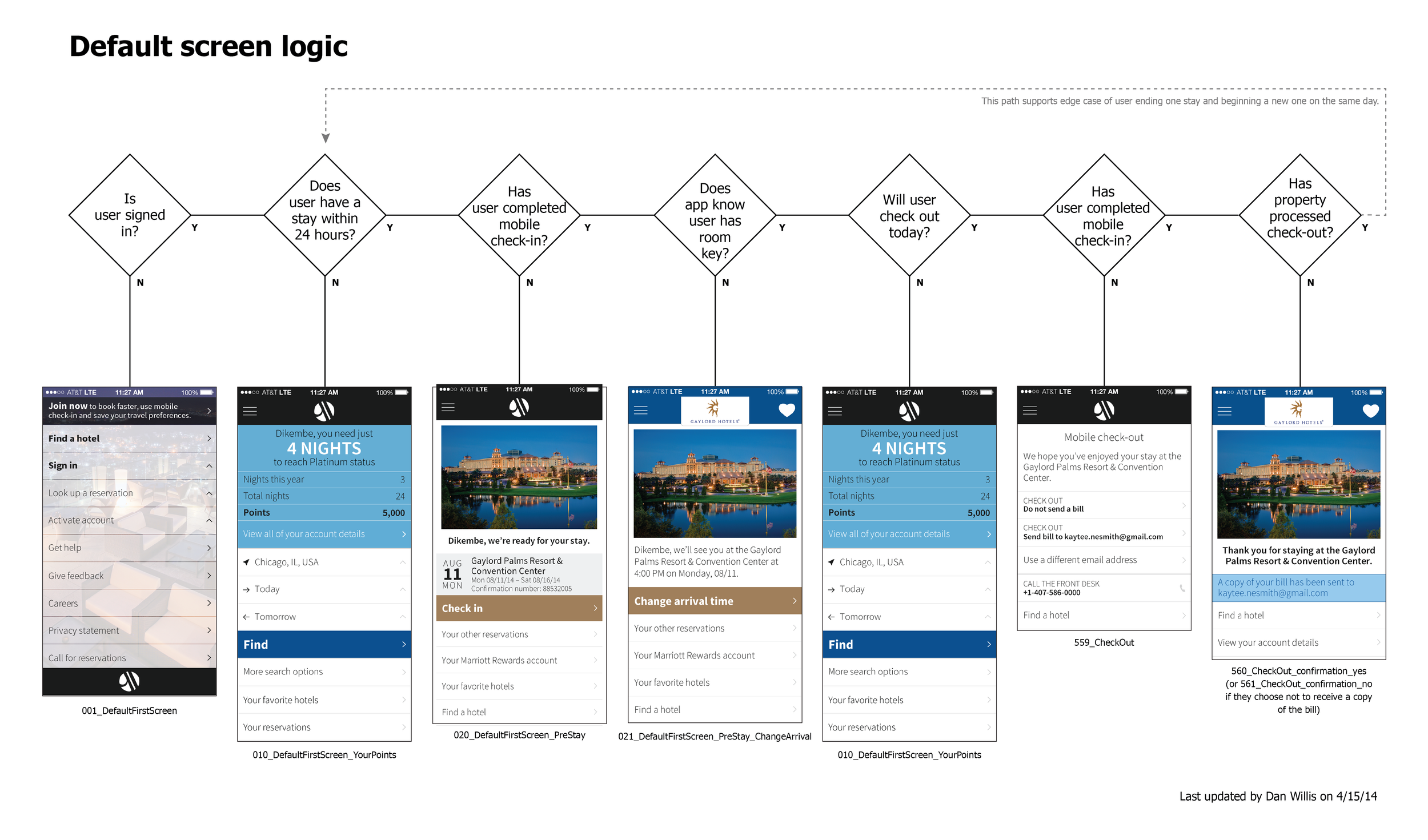
Mapping how to leverage user goals to expand how we support them.
I also introduced four pervasive design tactics:
Design for fat fingers
Use platform conventions unless they hinder the experience
Help the user imagine wonderful hotel stays with strong imagery
Align with marriott.com design system standards, especially for branding
Outcome
The design strategy was a radical departure for Marriott mobile products and our development vendor resisted my approach and design tactics, but by constant stakeholder and design management, I was able to steer the solution through the organization. (The redesign launched a full year after I left Marriott, but the key aspects of the design survived through to implementation.)


Herding Public Media Cats
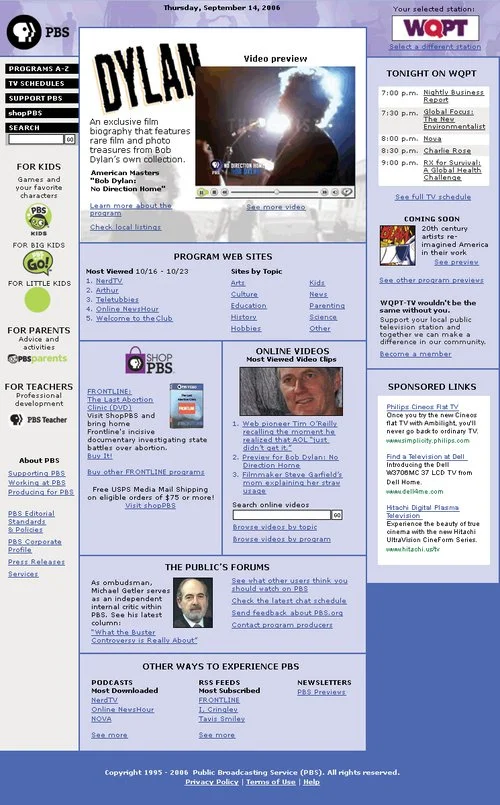
As it is in many organizations, the home page at PBS was a political hotcake. But in the peculiar public media environment of the United States, the greatest impediments to progress were cultural and the PBS.org Web site design remained unchanged for years as a result.
A CASE STUDY
My roles
Designer
Facilitator
User research lead
As it is in many organizations, the home page at PBS was a political hotcake. But in the peculiar public media environment of the United States, the greatest impediments to progress were cultural and the PBS.org Web site design remained unchanged for years as a result.
Funding funneled through the local stations rather than corporate headquarters and so every station expected to be part of any significant discussion of digital strategy or tactics. The only thing the local stations could agree on, however, was their dissatisfaction with national headquarters.
Culturally, PBS focused on what Web pages looked like much more than on what those pages needed to accomplish so, historically, redesign efforts devolved into endless arguments about color choices and imagery.
Solution: Hit the road to bring station leadership into the design process.
Rather than presenting a polished design, I created a number of conceptual prototypes that intentionally took on PBS' sacred cows. My tactics included:
Replacing brand-based local station representation with mechanisms focused on functionality
Prominently displaying commercial advertising and e-commerce avails
Committing chunks of the page to the transparency to PBS finances
Radically expanding feedback and contact opportunities
In direct opposition to tradition, I promoted less content and did it with more space, forcing arguments about home page real estate rather than allowing compromise to dominate.
I took these prototypes on the road visiting small, medium and large stations to gather reactions. I opened the design process up to dozens in the PBS community, but steered the conversations away from aesthetics and over to user goals and station business needs.