Case studies
Maturing CX Capabilities at the Department of Labor
The Department of Labor’s workers compensation programs were very customer-oriented, but lacked the tools for collecting or analyzing their customers’ needs.
A CASE STUDY
My roles
Business development
Consultant
Researcher
Workstream lead
The Department of Labor asked Centers of Excellence (CoE) to help the Office of Workers' Compensation Programs (OWCP) improve the experiences of their many customers. I designed an engagement with three OWCP programs:
The Federal Employees’ Compensation Act (FECA) program serves injured or ill federal employees. Beneficiaries of the program are Federal Bureau of Investigation agents, postal workers, office workers, emergency responders, forest rangers, air traffic controllers, firefighters, Capitol police officers, and many others.
The Black Lung program supports coal miners, construction workers, and transportation workers who are regularly exposed to respirable coal mine dust and who have black lung disease.
The Energy program serves current and former nuclear weapons workers who have been exposed to radiation or other toxic substances.
I led the team that interviewed program staff and leaders to better understand the programs’ services and talked to the customers who rely on program services. The team evaluated programs based on the CoE CX Maturity Model. (I designed the model to define capabilities based on core CX functions.)
The three programs have made progress in measurement capabilities, tracking customer satisfaction and collecting performance-based metrics for timeliness, but overall, they lack human-centered design and customer experience expertise. Collecting, analyzing and widely distributing customer-related data is also an area of potential growth.
Outcome
We collaborated with staff and leadership to develop strategies and tactics for getting each of the programs to the next level in the CX Maturity Model. Four primary strategies emerged:
Share CX expertise across OWCP programs
Share tools across OWCP programs
Search engine optimization
Help the programs with their own strategies and tactics
Reimagining Workforce Services for the Department of Labor
The Department of Labor brought CoE in to research the Employment and Training Administration and make recommendations for improving their service delivery.
A CASE STUDY
My roles
Consultant
Usability expert
Workstream lead
COVID-19 killed more than a half million people in the U.S. by early 2021. Over 29 million had tested positive and the global pandemic triggered an economic recession. In response, the U.S. Congress passed the American Rescue Plan, a $1.9 trillion economic stimulus bill to speed up the country's recovery.
The Department of Labor (DOL) is responsible for the well being of U.S. wage earners and job seekers. The agency’s chief innovation officer wanted the Employment and Training Administration (ETA) to improve service delivery to the nation’s workforce. He reached out to GSA’s Technology Transformation Services (TTS) for help.
Solution: Research ETA customer needs and recommend foundational strategies and tactics.
I led the team that researched one of ETA’s longest standing digital tools, the CareerOneStop website. We collaborated with ETA leadership to transform findings into initiatives for improving the experiences of CareerOneStop customers and transforming how ETA provides its services.
My team’s activities included:
Heuristic evaluation
Usability testing
Web traffic analysis
Customer interviews
American Job Center visits
Outcome
Our primary recommendations:
Create key performance indicators (KPIs) that track the experiences of customers
Establish a customer research practice
Adopt a product development approach
Build continuous improvement capabilities instead of launching a redesign
Expanding Consular Affairs’ CX capabilities
Training alone wasn’t going to be enough to help the U.S. Coast Guard expand its own CX capabilities.
A CASE STUDY
My roles
Business development
Workstream lead
Consular Affairs (CA) is the public face of the Department of State. It is a massive organization and as a result, initiatives to improve customer experiences tend to be unevenly distributed across the bureau. When they wanted to invest in improving the experiences of their customers, they came to the Centers of Excellence (CoE) for strategy and leadership.
I designed CoE’s largest customer experience project. We conducted foundational human-centered design activities across five workstreams:
CA/CX culture and policy
Overseas Citizens Services (OCS)
Passport Services
Travel.state.gov
Visa Services
I led the Passport Service workstream where our challenge was to create a foundation for human-centered design (HCD) while training and supporting their staff.
Solution: Conduct foundational customer research while bringing Passport Services staff and leadership along for the ride.
I managed a team of contractors. After conducting and analyzing a dozen stakeholder interviews to better understand the current state, I supervised user researchers in the creation of a foundational analysis of the needs of passport customers. The team researched two types of internal customers, call center staff and the people who adjudicate passport applications. That research informed a journey mapping workshop that I designed and facilitated with participants from across Passport Services.
A separate modernization effort emerged outside of our activities, which forced us to pivot to support the new work. I joined the modernization leadership team. We extended the initial customer research to develop service blueprints. I helped design and run a cross-departmental workshop, leveraging the service blueprints. We folded participant recommendations into modernization initiatives.
Impact
Passport Services leads all other Consular Affairs directorates in the breadth and depth of their HCD efforts. With our help, Passport Services staff and leadership developed and delivered their initial program of modernization initiatives.
Going Native
I designed the experience for Marriott’s first native iOS app around the concept that the more we knew about the user, the more we could do to help them.
A CASE STUDY
My roles
Director of Mobile Experience Design, Marriott International
Engagement lead
Designer
Up until the redesign, Marriott had published its mobile products on the constrained and idiosyncratic Kony platform. Marriott's future business success depended on launching truly native iOS and Android apps.
Marriott's digital products were defined by the organization's legacy systems. Business rules were generally inflexible and occasionally inscrutable. Crafting a successful mobile app design required optimizing platform value while navigating the many practical limitations of room search, booking and Marriott Rewards systems.
Solution: Create a human-centered design strategy for the redesign
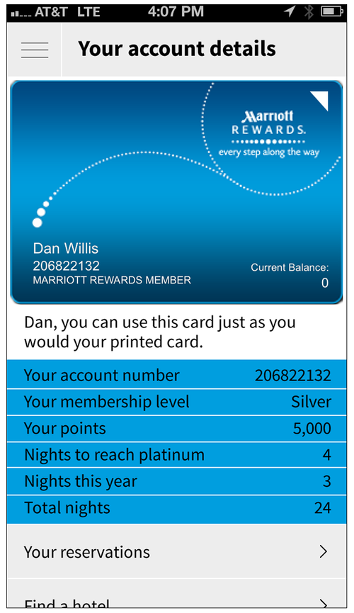
I designed the experience around content strategy, specifically the primary concept that the more we knew about the user, the more we could do to help them. That led to the design of four user states:
Not signed in
Signed in with no upcoming reservations
Signed in with an upcoming reservation
Signed in during a stay
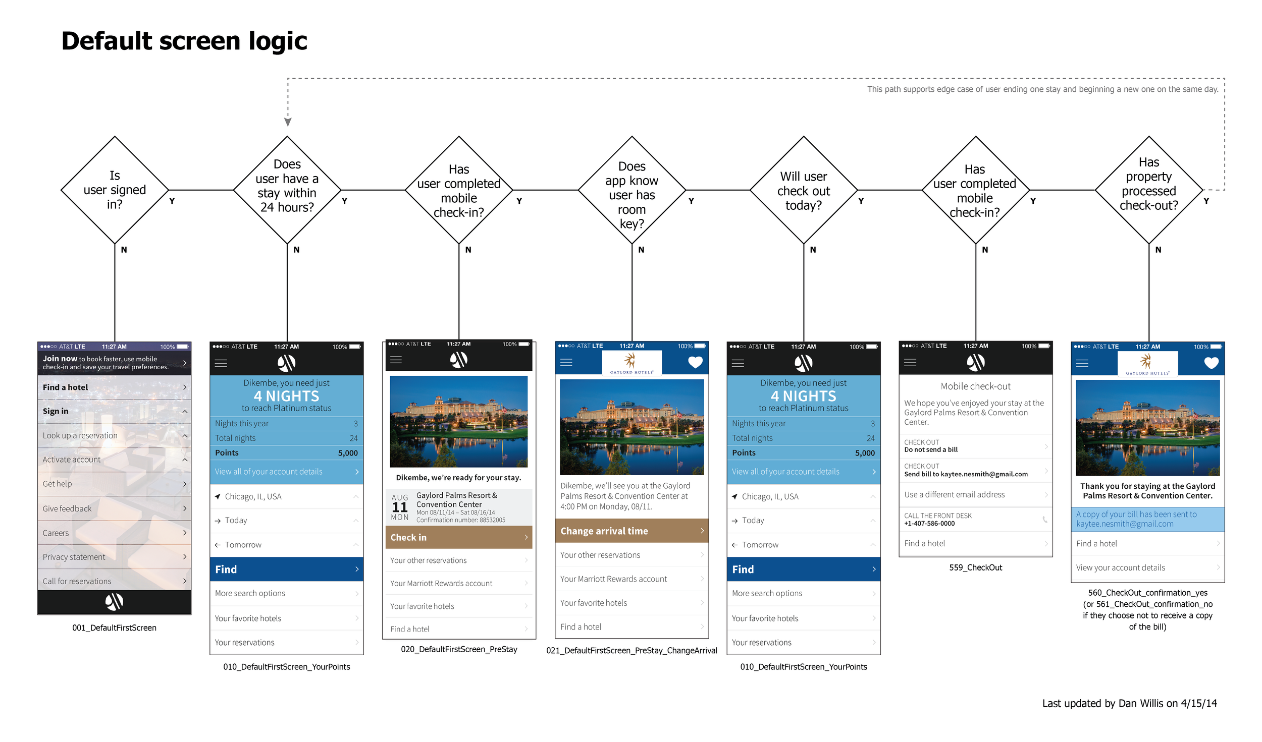
Mapping how to leverage user goals to expand how we support them.
I also introduced four pervasive design tactics:
Design for fat fingers
Use platform conventions unless they hinder the experience
Help the user imagine wonderful hotel stays with strong imagery
Align with marriott.com design system standards, especially for branding
Outcome
The design strategy was a radical departure for Marriott mobile products and our development vendor resisted my approach and design tactics, but by constant stakeholder and design management, I was able to steer the solution through the organization. (The redesign launched a full year after I left Marriott, but the key aspects of the design survived through to implementation.)


Navigating Dinosaurs
One of the largest and most celebrated museums in the world, the American Museum of Natural History houses 45 permanent exhibition halls and averages five million visits annually. Unfortunately, because it’s made up of 27 interconnected buildings constructed over the last 130 years, it can also be a really hard place to find a bathroom.
A CASE STUDY
My roles
User experience design lead
User research lead
One of the largest and most celebrated museums in the world, the AMNH houses 45 permanent exhibition halls and averages five million visits annually. Unfortunately, because it’s made up of 27 interconnected buildings constructed over the last 130 years, it can also be a really hard place to find a bathroom.
The museum asked for help imagining their digital future.
Solution: Research museum customer needs and produce the musuem’s first digital product requirements
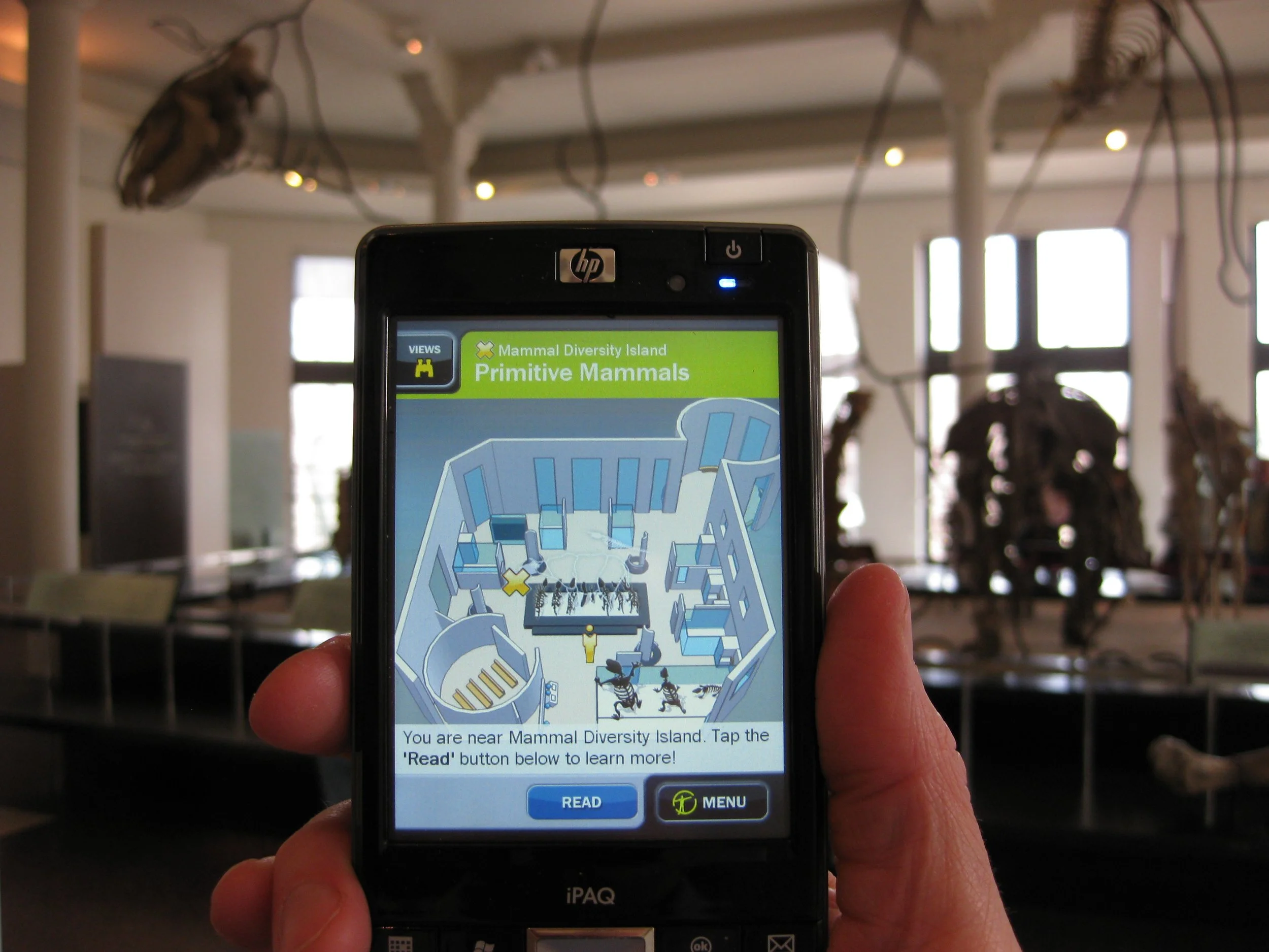
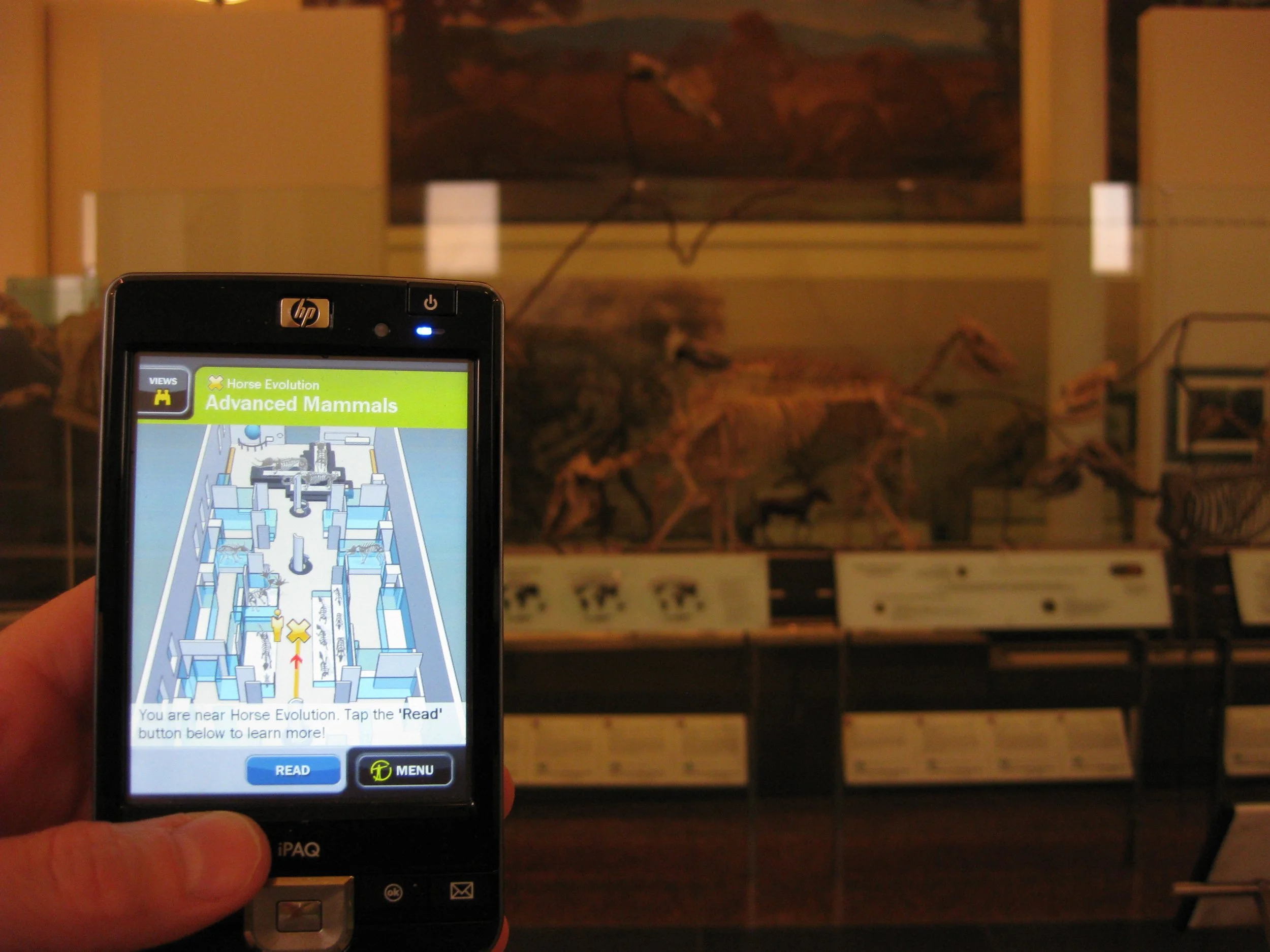
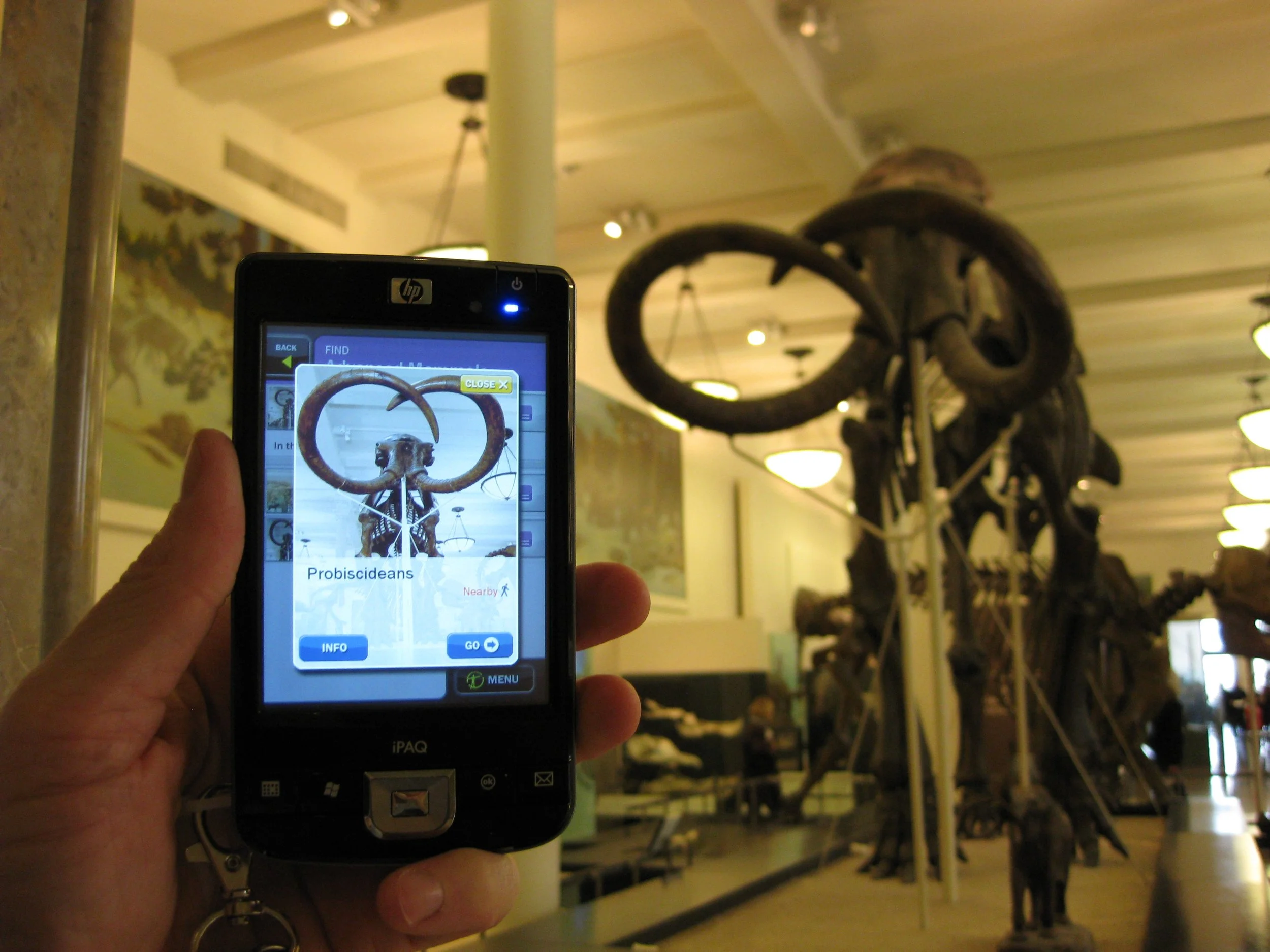
We did the discovery work for a handheld navigation device that visitors would rent from the museum. (At that time early in the 21st century, very few museums in the world had successfully implemented digital wayfinding solutions.) We focused our attention on the museum's famous fourth floor, home of the dinosaur exhibits.
I converted the museum's needs into user-oriented requirements.
I led intense visitor and staff research to help further flesh out our understanding of the challenge.
I introduced three modes that would support most visitor experiences and based the design of a Flash prototype around the modal approach. I also incorporated the museum's favorite potential elements, digital tours and treasure hunts.
I assessed the handheld devices available at the time and plotted their value along a spectrum that had simple interaction at one end and sophisticated interaction at the other, arguing that only a sophisticated approach would be successful.
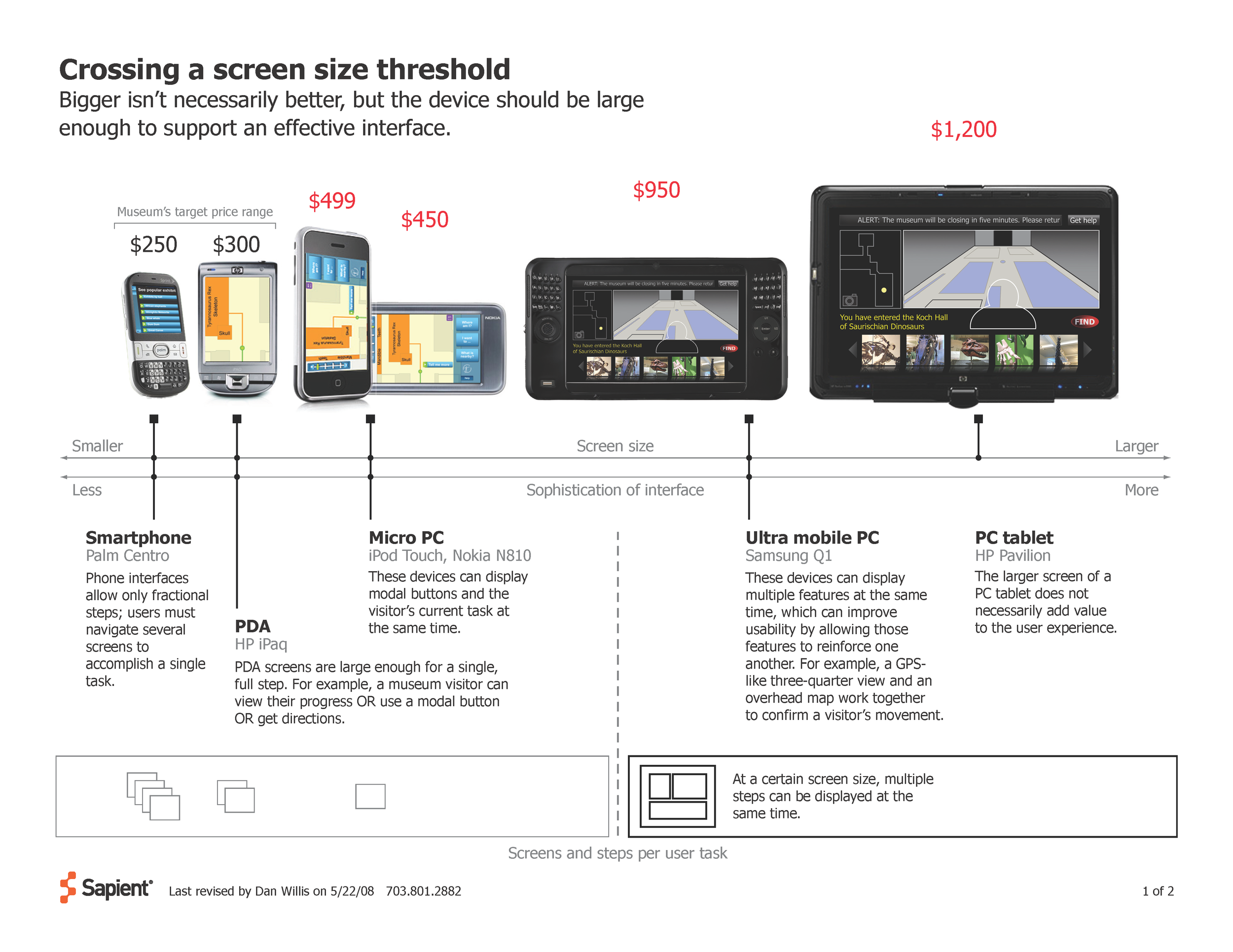
My analysis of the 2008 digital device market.
Outcome
We provided the materials the museum needed to created an RFP for a handheld rental device, but as that process played itself out, the personal mobile device market exploded. The foundational work I did is now nestled deeply inside the AMNH Explorer iOS app.


Leveraging Idiosyncratic Expertise
A small DHS agency nestled in rural Vermont depended an outdated, overworked, non-enterprise application to determine immigration status for national and local law enforcement agencies.
A CASE STUDY
My roles
Requirements team lead
User experience designer
A small DHS agency nestled in rural Vermont depended an outdated, overworked, non-enterprise application to determine immigration status for national and local law enforcement agencies. The agency’s success relied entirely on their specialists’ expertise in navigating the existing system, a quirky kludge of the application with a dozen other poorly integrated national and international data systems (many of which were also in great need of an overhaul.)
Solution: Develop requirements by focusing on the skills and needs of the software’s users
Designing an application to replicate the idiosyncratic expertise of the agency’s specialists would have meant extending the corrupt legacy system’s inefficiencies into the new solution. Instead, we focused on automating all tasks best performed with code and reframed the specialists’ processes to leverage immigration status expertise and judgment best supplied by human beings.
As the lead for the requirements team, I conducted specialist interviews, user testing, and other research methods to develop a holistic set of high-level requirements.
Based on those requirements, I introduced a series of conceptual documents to align the efforts of requirements, development, and QA teams. These documents included diagrams describing the jump from a non-automated to a semi-automated system, user flows tracking tasks both within and outside of the application, and a highly visual handbook that explained the basics of the agency and of immigration status determination.
I designed and coded a task-based prototype.
After handing off the prototype, wireframes, and UI specifications, I consulted on usability and tactical issues.
Herding Public Media Cats
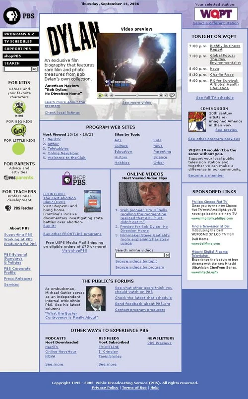
As it is in many organizations, the home page at PBS was a political hotcake. But in the peculiar public media environment of the United States, the greatest impediments to progress were cultural and the PBS.org Web site design remained unchanged for years as a result.
A CASE STUDY
My roles
Designer
Facilitator
User research lead
As it is in many organizations, the home page at PBS was a political hotcake. But in the peculiar public media environment of the United States, the greatest impediments to progress were cultural and the PBS.org Web site design remained unchanged for years as a result.
Funding funneled through the local stations rather than corporate headquarters and so every station expected to be part of any significant discussion of digital strategy or tactics. The only thing the local stations could agree on, however, was their dissatisfaction with national headquarters.
Culturally, PBS focused on what Web pages looked like much more than on what those pages needed to accomplish so, historically, redesign efforts devolved into endless arguments about color choices and imagery.
Solution: Hit the road to bring station leadership into the design process.
Rather than presenting a polished design, I created a number of conceptual prototypes that intentionally took on PBS' sacred cows. My tactics included:
Replacing brand-based local station representation with mechanisms focused on functionality
Prominently displaying commercial advertising and e-commerce avails
Committing chunks of the page to the transparency to PBS finances
Radically expanding feedback and contact opportunities
In direct opposition to tradition, I promoted less content and did it with more space, forcing arguments about home page real estate rather than allowing compromise to dominate.
I took these prototypes on the road visiting small, medium and large stations to gather reactions. I opened the design process up to dozens in the PBS community, but steered the conversations away from aesthetics and over to user goals and station business needs.